Design Guide — Sheet G-001
The system behind
Meridian Tower.
This page documents the palette, typography, 3D technique, and rationale used to build this site — a working reference for anyone extending or evaluating the design.
01 — Palette
Three colors, deliberately.
Ink
#0A0A0A
Primary background. Near-black, not pure black — keeps photography and wireframe lines from crushing.
Paper
#F5F4F0
Primary type and line color. An off-white with warmth, like archival drawing stock.
Steel
#3B5470
The single accent. A desaturated blue-gray pulled from glass curtain-wall reflections. Used sparingly — for emphasis, not decoration.
No gradients-as-crutch. No purple/blue SaaS gradient anywhere on this site. Real estate credibility comes from restraint — every accent color we didn't use is a decision, not an oversight.
02 — Typography
An editorial serif, and a technical mono.
DISPLAY / HEADLINES
Fraunces
A high-contrast, high-optical-size serif with a soft wonk axis. It reads as a monograph about a building rather than a brochure — closer to an architecture journal masthead than a typical real-estate sans. We lean on its variable optical size for the largest headlines, where its ink traps and subtle quirks become part of the texture.
LABELS / DATA / NAV
IBM Plex Mono
Every number, label, coordinate annotation, and nav item runs in tracked-out uppercase Plex Mono. It borrows the vocabulary of architectural drawing sets and financial data tables — the two documents this brand actually produces day to day.
03 — Signature Technique
A scroll-driven massing study, not a rendered tower.
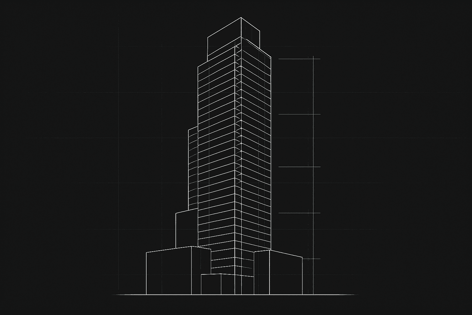
The hero uses React Three Fiber to render a stepped, wireframe massing model — five stacked volumes of decreasing footprint, the kind of blocky study model an architect builds before anyone draws a facade. It is deliberately abstract: no windows, no literal skyline, no stock-photo skyscraper.
As the user scrolls the hero section, we track scroll position as a 0-to-1 progress value and drive the camera and model directly from it: the camera arcs and rises, the model rotates and settles, all tied to a single scrollProgress ref updated on scroll, read every frame inside useFrame.
Why this fits a CRE brand specifically: commercial real estate sells volumetric thinking — massing, floor plates, setbacks, zoning envelopes — long before it sells finished facades. A wireframe study model communicates "we understand buildings structurally" in a way a glossy rendered tower never could.
04 — Overall Rationale
A monograph, not a brochure.
EDITORIAL GRID
Wide margins, a 12-column grid, and generous whitespace borrowed from architecture monographs — not the dense, stat-heavy layouts typical of real estate marketing sites.
BLUEPRINT MOTIF
Hairline grids, coordinate annotations, sheet numbers, and scale callouts recur across the hero, section dividers, and this page — a consistent chrome that signals technical rigor rather than pure decoration.
RESTRAINT AS CONFIDENCE
A firm with a strong track record doesn't need loud design. Three colors, two typefaces, and hard data do more to build trust than an animated gradient ever could.
Built as part of a 12-site Laimen AI design portfolio.
← BACK TO SITE